
Interview by Alberto F.
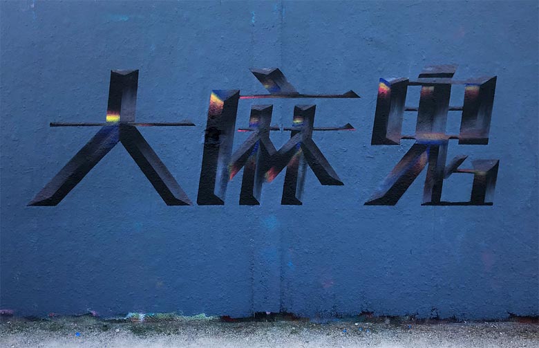
Tacos has surprised us lately with pieces based on Chinese letters. It’s not the first time that we see graffiti done in Asian forms of writing, but the time may have come to ask ourselves where there still is a hegemony of Latin letters in graffiti, when it has been more than consolidated as an international culture. We wanted to talk to Tacos about these, and other personal topics.
-Where are you from and when did you start painting?
I was born in the south of France in a city called Grasse, but have been moving a lot since.
I started graffiti in 2008 at 13 yo with a good friend of mine in Shanghai, where I lived until I was 18.
“My goal was to experiment with something different than what motivated me in the first place.“
-We are very surprised by your latest pieces in Chinese. Tell us why you’re doing it.
As a recent generation writer and a graffiti lover, I’ve got lost in trying to find my own style, trying to be original, while graffiti codes are for the most part always the same. My goal was to experiment with something different than what motivated me in the first place. Later I did graphic design studies which got me interested in typography, logotype and strict rules. Plus, my nostalgia and love for Chinese culture and it’s language played a part. I find the complexity of Chinese characters amazing when applied to the graphic design rules and graffiti.


-Why do you think graffiti has developed mainly in the Latin alphabet?
I would say because this hip-hop movement comes from a country which uses the Latin alphabet, and other Latin-based countries developed it further. So even writers from countries with other alphabets started to write using the Latin alphabet to be internationally recognized–that’s where the movement was going.
-Do you know writers who use other alphabets on time?
I actually don’t know many writers who regularly use different alphabets, only experimenting with it sometimes. But I see more and more people using Chinese because they realized that it’s pretty graphic and gives a nice Asian feel to the wall.


“We’ve started to reach the limits of possibility in graffiti and it’s turning around. The potential of styles using these alphabets is huge.“

-How do you see the possibility of graffiti developing completely in other alphabets, that is, in Russia they use the Cyrillic alphabet, in Greece the Greek alphabet, in the Arab countries the Arabic alphabet, etc….?
I think the potential is huge, it would give such a fresh change to graffiti and these alphabets are so rich with beautiful characters.
People need to dare to use other alphabets, even if they don’t see other writers doing it.
-Do you think it will happen in the future?
I think it will happen for sure. We’ve started to reach the limits of possibility in graffiti and it’s turning around. The potential of styles using these alphabets is huge.
-Your style has taken big leaps…. can you explain this evolution to us?
As I mentioned, I’m from a late generation, influenced by pretty futuristic styles. So much has been done already, so the idea is to break into new terrain.
After graduating in Shanghai, I came to Paris to study and had the chance to meet those who influenced me when I was younger and to paint next to them. It gave me lot of insight. I’m also getting more and more influenced by graphic design codes and approaches.


-Which writers have influenced your style?
There are a lot. Petro, Gary, Satone, Epok, Dashe, to name a few.
-What are you trying to reflect or what feeling do you want to give with your pieces?
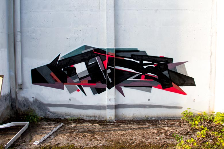
For the really graphic ones, I try to push the limits by being perfectly geometrical and clean, using tape of course, but no projector or stencils, to get an almost digital look. The result is visually satisfying and unexpected in terms of graffiti.
For the more classic ones, I just want to break the rules and give it a clean graphic look.
-How do you choose the colors? Give a concrete example of one of your latest pieces.
I really like to use a lot of pastel colors and make them stand out with a few acidic ones. I especially like when the piece is monochrome.
I try to be as minimalist as I can, trying not to balance all the colors together but unexpected somehow. I also try to use a lot of contrast so I often use black and white together.
“I like the contrast between a crazy wild style and a ridiculous name.“
-What do you do when you are not painting?
I just got a master’s degree in graphic design so my professional life will start pretty soon. I also like to cook a lot. I recently started to paint on canvas which I’d like to develop.
-How do you see your style in two years?
I hope to be build on the combination between graphic design, graffiti and Chinese culture but I’m also trying to be careful not to drift away from good old classic graffiti pieces.
-Why Tacos?
I have to admit, I was pretty young and didn’t take it seriously. But I kept it because I noticed that in graffiti, the names are often aggressive, especially when it started. It was made by kick-ass kind of people and it stayed in the tradition. So I liked my « not so serious » name. In the meantime, I actually started to take it seriously.
I like the contrast between a crazy wild style and a ridiculous name.


Add a comment

2 What do you think?
Add a comment